This is one of the most important blog posts
we've published. If you struggle with colour mixing or following with a
lesson where you don't have exactly the same colours, this is a must read.
How to Use Negative Space in Figure Drawing
This is the ONE and ONLY time that you are allowed to be negative about
your drawings. This quick video from artist Jane Lazenby talks about how
to get your eyes to recognise negative shapes. It's a really useful
skill for any artist to have.
How to Paint Florals in Pastel
A lovely, simple look at how to blend and layer pastels to create a
pretty in pink floral still life. With artist Michael Howley.
Acrylic Palettes & Accessories
As with all painting media, there are a number of accessories available
that can make your acrylic painting experience easier more enjoyable. In
this blog, Bob considers which are the must-haves to help get you
started.
Acrylic Mediums & Additives
Using mediums and additives to change the properties of your acrylic
paint can be exciting but also daunting. Bob takes a look at the most
common types of products on offer and offers suggestions on what to buy.
Reader Poll:What style of artwork do you prefer?
In last month's poll, we asked where you make most of your art. Here were the top 5 answers from over 2000 artists:
Spare/guest bedroom: 23%
Dedicated art room/studio: 22%
Dining room: 17%
Kitchen: 13%
Home office: 11%
In this week's poll, let's find out whether most people are attracted to
very loose and impressionistic art or photo-realism or something
in-between.
There's definitely a bias towards photo-realism in non-artists. Let's
see if that holds true for people who make art and by how much...
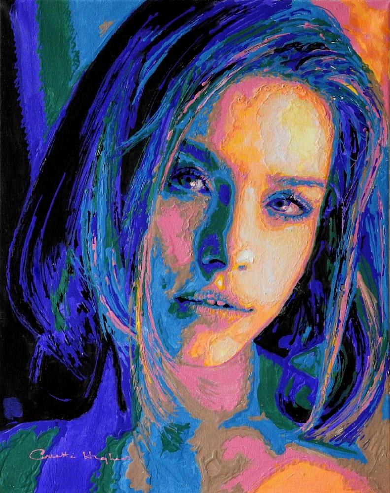
This
is 'Sofia' by ArtTutor member Collette - a beautiful portrait painting
with a very unique and eye-catching style. You have to admire those
colours and textures!
It's
a great example of how you can get a little bit crazy with your colour
palette and yet retain a very believable and recognisable outcome. You
and I may not know who 'Sofia' is but we can tell it's a very strong
portrait, with excellent proportion and placement of the facial
features.
So
how, on a practical level, can you play about with your own style
without simply ending up making a mess? Here are two tips that I think
can help...
1. Get your drawing right.
If your underdrawing is out of proportion - if it's poorly observed -
it won't matter how refined your shading, blocking-in or blending is.
You can obsess over perfect colour matches all you like but the final
result will still jar the observer's eye.
Yes, you can trace or use a grid to get a solid outline. And many top
artists do that for speed. But if you lack the observational awareness
to retain good proportion and good shape as you paint over your lines,
that initial tracing or grid drawing won't save you.
So get your outline drawing right - take as long as it needs - and then
constantly review it throughout the painting or shading in process.
Nothing will have a bigger impact on the final outcome, regardless of
style.
2. Good tonal value makes colour choice (largely) irrelevant.
When most hobby artists look at the portrait above (or this one of Daniel Craig) they assume it's the choice of colour that gives it the wow factor.
And it is. But only because the underlying tonal values have been carefully retained.
'Value' simply refers to how light or how dark a colour is. Two
completely different colours, like red and blue, can be equally as dark
or light as each other. As long as you can observe the underlying value,
you can swap, say a flesh tone, for a green or a purple or luminous
yellow, or any other colour like... and you'll retain that sense of
solidity and depth.
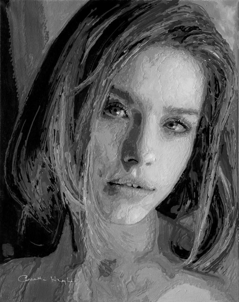
To make this easier, convert your reference photo to black and white.
This stops you from being distracted or influenced by existing colours.
Plus, it lets you see the tonal values much more easily.
All you have to do then is mix a colour (go crazy!), squint your eyes as
you look at it, and try to match the lightness or darkness to the grey
tone on your reference. Easier said than done I know, but give it a go.
Oh, and here's Collette's painting in black and white. Looking at it,
you have no idea that an eclectic colour palette has been used. And
that's because colour is largely irrelevant in the presence of good
tonal values.
How to Paint Still Life Like Cézanne
No-one paints still life quite like Cézanne...until YOU came along that
is. From how to set up a still life composition to making colour palette
choices, this is a joy for anyone wishing to learn how to paint in the
style of one of the world's most famous post-impressionist artists. With
artist Lucy Somers.
Alcohol Inks - Surfaces and More Techniques
A medium ever-growing in popularity, alcohol inks are such a fun way to
experiment in creating vibrant artwork and Tammy Crawford is on hand to
take you through the process . Think jewelled tones and pretty patterns.
Wintry Scenes Part 1: How to Draw Trees in Ink
As we continue to wrap up warm against the winter chill (at least for
us lot in the northern hemisphere) there couldn't be a better time to
appreciate the beauty of trees without their leaves. Check out guest
tutor Julie Askew's tips and why not have a go at drawing some of the
trees in your garden or local park?
Wintry Scenes Part 2: How to Paint Snow in Acrylics
Moving on from using inks, this blog is about how to paint snow-laden
branches that sparkle using acrylics. It actually involves using more
colours from your palette than you may realise!
Which Drawing or Painting Medium Should You Start With?
Whether you're a beginner, or maybe you've become a little lost along
your creative journey, this blog will take you right back to basics and
help you determine which drawing or painting medium is the perfect fit for you.
How to Photograph Your Artwork (For Non-Photographers)
For any self-confessed 'non-photographers' out there Phil has written a
guide on how to take great digital images of your work, using just a
smartphone and some easy-peasy photo editing. You've worked hard on that
piece of artwork, it's time to show it off.
Reader Poll:Where do you make most of your artwork?
The
dining room table? The kitchen table? A spare bedroom perhaps? Or maybe
you’re lucky enough to have a dedicated art space? Cast your vote and
see where others make their art.
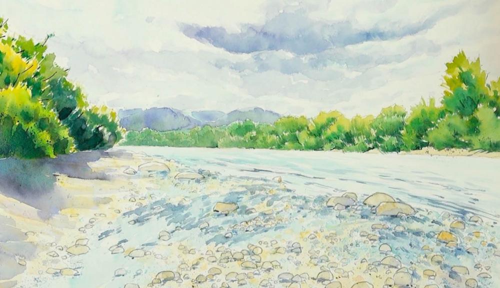
River Scene in Watercolour
This simple river scene provides the opportunity for any watercolour
newbie to combine paint and pencil to create detail. With artist Michele
Illing.
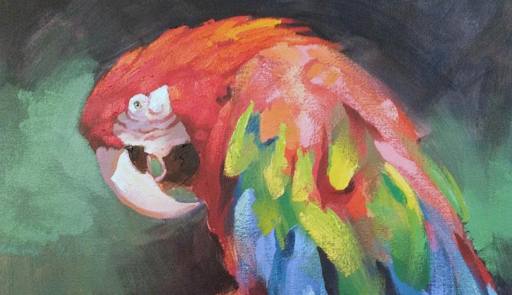
Macaw in Acrylics
Wildlife artist Tom Shepherd demonstrates how not to get in a flap when
painting this brightly-feathered Macaw in acrylics (suitable for oils).
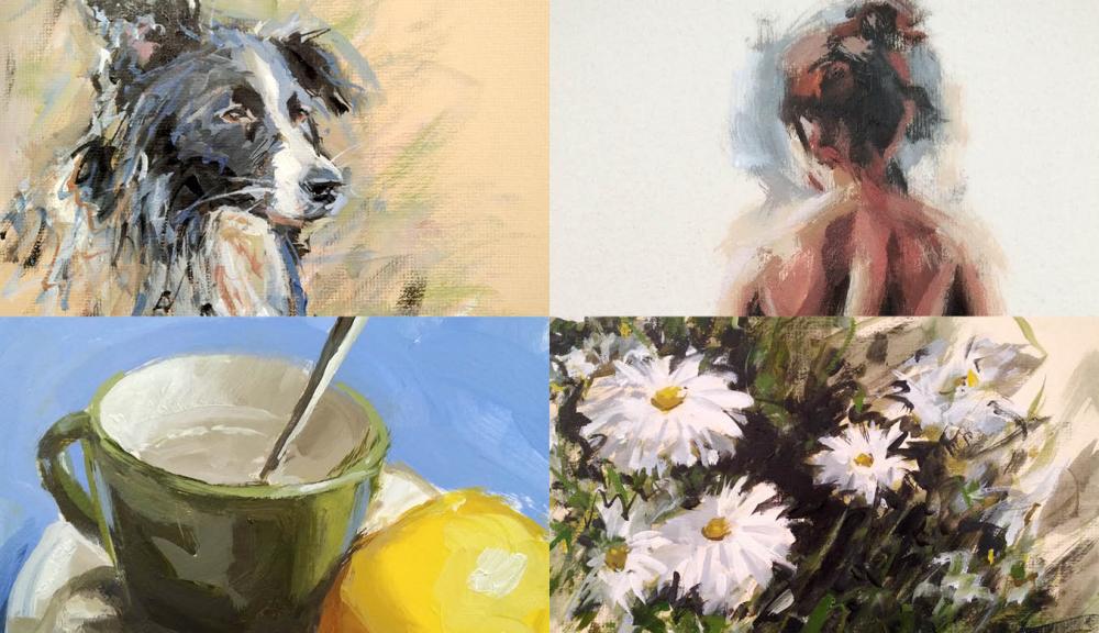
The Painted Sketch - Acrylics & OilsDid
you know that creating quick, loose paintings in around 30 minutes can
improve your artwork longterm? Artist Peter Keegan shows you how in The Painted Sketch course.
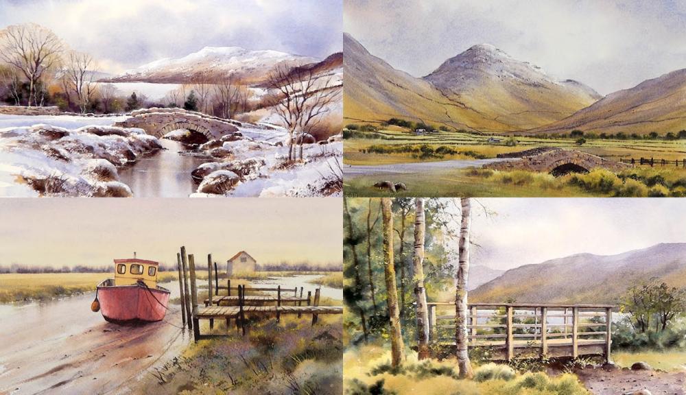
Advanced Watercolour Landscapes 4
Some of artist Geoff Kersey's favourite spots in the UK provide
picture-postcard views for any artists looking to advance their
watercolour skills.
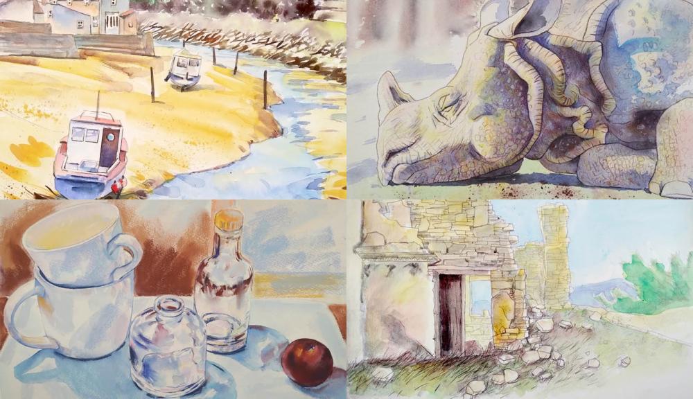
Mixed Media PaintingArtist
Michele Illing explores the possibilities that open up when combining
watercolour paints with other mediums such as pastels and watercolour
pencils.
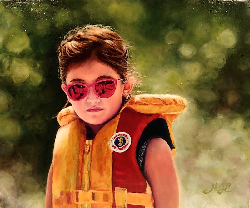
ArtTutor
member Myrna Jean was a commissioned by a co-worker to complete a
painting of his daughter. This incredible oils portrait is the result.
I love the way she's captured the light on the left side of Mira -
particularly in the hair. The shades with their bold monochromatic
reflections really grab your attention and pull your gaze back to the
face.
While the choice of colour, value and blending are all superb, I can
tell this will be a strong likeness even without seeing the reference.
Whenever a portrait looks really natural and the face well-proportioned,
the chances are the likeness will be strong. Take your time over the
drawing out stage and continually check the proportions, shapes and
positions of facial features as you render them in your medium of
choice.
The defocused background is a great choice for any portrait - human or
animal. The contrast with sharp, crisp detail gives the subject a drama
and importance. The same 'depth of field' trick has been used in
Hollywood for decades.
A fantastic painting that I'm sure the will have delighted her colleague!
Phil Davies
Get a headstart on improving your drawing for 2019
With40% OFFour5-Day Sketching Challenge Course. Here at ArtTutor, we're staunch believers that good drawing technique is the foundationforany creative process. Sketch your way to success using discount code40SKETCHat the checkout.
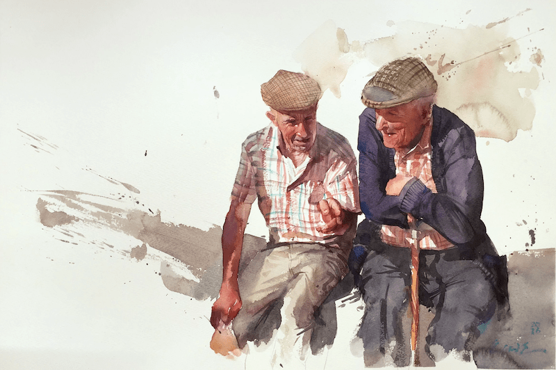
Check outEudes Correiaon Instagram (search:eudes_watercolor). He paints the most incredibly captivating watercolour portraits making full use of the medium's alluring colour bleeds!