|
|
|
|
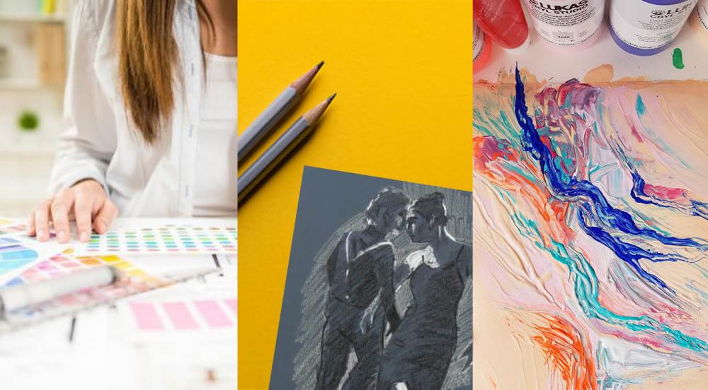
Articles, Tips & Videos
This is one of the most important blog posts
we've published. If you struggle with colour mixing or following with a
lesson where you don't have exactly the same colours, this is a must read.
How to Use Negative Space in Figure Drawing
This is the ONE and ONLY time that you are allowed to be negative about
your drawings. This quick video from artist Jane Lazenby talks about how
to get your eyes to recognise negative shapes. It's a really useful
skill for any artist to have.
How to Paint Florals in Pastel
A lovely, simple look at how to blend and layer pastels to create a
pretty in pink floral still life. With artist Michael Howley.
Acrylic Palettes & Accessories
As with all painting media, there are a number of accessories available
that can make your acrylic painting experience easier more enjoyable. In
this blog, Bob considers which are the must-haves to help get you
started.
Acrylic Mediums & Additives
Using mediums and additives to change the properties of your acrylic
paint can be exciting but also daunting. Bob takes a look at the most
common types of products on offer and offers suggestions on what to buy.
|
|
|
|
|
|
|
Reader Poll: What style of artwork do you prefer?
In last month's poll, we asked where you make most of your art. Here were the top 5 answers from over 2000 artists:
- Spare/guest bedroom: 23%
- Dedicated art room/studio: 22%
- Dining room: 17%
- Kitchen: 13%
- Home office: 11%
In this week's poll, let's find out whether most people are attracted to
very loose and impressionistic art or photo-realism or something
in-between.
There's definitely a bias towards photo-realism in non-artists. Let's
see if that holds true for people who make art and by how much...
|
|
|
|
|
|
|
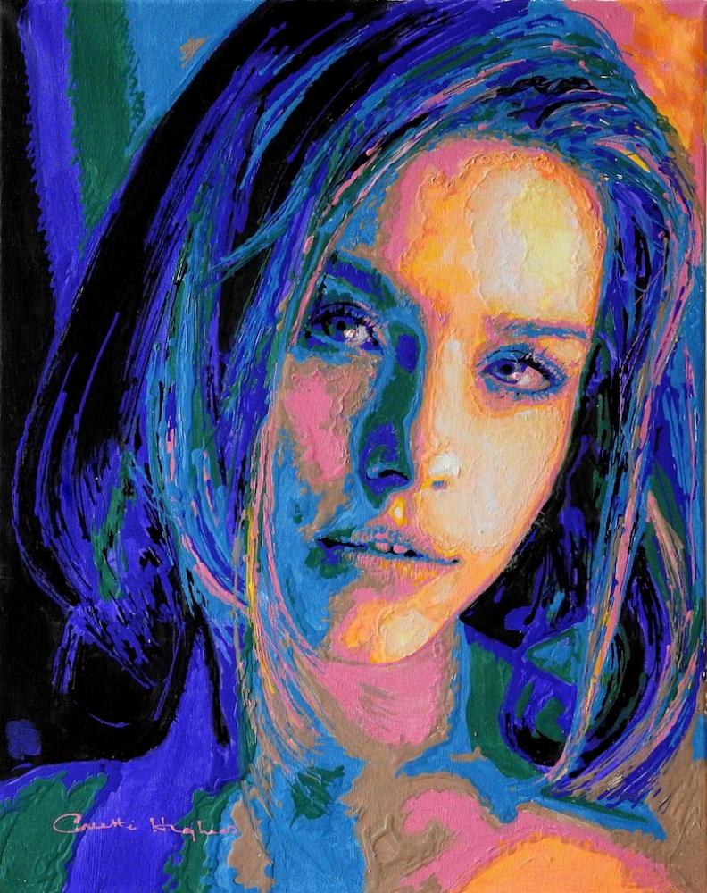
"Sofia" by Collette - Acrylics on canvas
Member Artwork Showcase
This
is 'Sofia' by ArtTutor member Collette - a beautiful portrait painting
with a very unique and eye-catching style. You have to admire those
colours and textures!
It's
a great example of how you can get a little bit crazy with your colour
palette and yet retain a very believable and recognisable outcome. You
and I may not know who 'Sofia' is but we can tell it's a very strong
portrait, with excellent proportion and placement of the facial
features.
So
how, on a practical level, can you play about with your own style
without simply ending up making a mess? Here are two tips that I think
can help...
1. Get your drawing right.
If your underdrawing is out of proportion - if it's poorly observed -
it won't matter how refined your shading, blocking-in or blending is.
You can obsess over perfect colour matches all you like but the final
result will still jar the observer's eye.
Yes, you can trace or use a grid to get a solid outline. And many top
artists do that for speed. But if you lack the observational awareness
to retain good proportion and good shape as you paint over your lines,
that initial tracing or grid drawing won't save you.
So get your outline drawing right - take as long as it needs - and then
constantly review it throughout the painting or shading in process.
Nothing will have a bigger impact on the final outcome, regardless of
style.
2. Good tonal value makes colour choice (largely) irrelevant.
When most hobby artists look at the portrait above (or this one of Daniel Craig) they assume it's the choice of colour that gives it the wow factor.
And it is. But only because the underlying tonal values have been carefully retained.
'Value' simply refers to how light or how dark a colour is. Two
completely different colours, like red and blue, can be equally as dark
or light as each other. As long as you can observe the underlying value,
you can swap, say a flesh tone, for a green or a purple or luminous
yellow, or any other colour like... and you'll retain that sense of
solidity and depth.
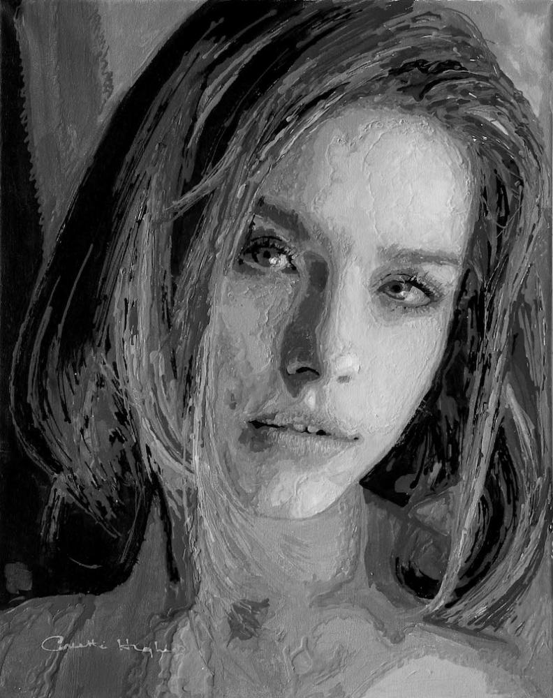
To make this easier, convert your reference photo to black and white.
This stops you from being distracted or influenced by existing colours.
Plus, it lets you see the tonal values much more easily.
All you have to do then is mix a colour (go crazy!), squint your eyes as
you look at it, and try to match the lightness or darkness to the grey
tone on your reference. Easier said than done I know, but give it a go.
Oh, and here's Collette's painting in black and white. Looking at it,
you have no idea that an eclectic colour palette has been used. And
that's because colour is largely irrelevant in the presence of good
tonal values.
Phil Davies.
|
|
|
|
|
|
|
via mensagem de arttutor...

Sem comentários:
Enviar um comentário